Brittany Gabey
DESIGN + ILLUSTRATION
Logo and Visual Identity System

When US Polyco approached Creative Director Mary Tveit at Sol Design Co., they needed a brand and marketing partner. In collaboration with designer Jake Simonds-Malamud, we created a working “kit of parts” for an updated visual identity based on the tri-hexagonal logo they had previously used. The inclusion of the hexagon in some way was their primary requirement for this rebrand.

Jake and I created a host of variations on hexagonal logo marks, and after client review, chose this very simplified ode to their previous logo. The original logo contained three hexagons nested together. To maintain a triad within a single hexagon, I coupled neighboring sides of the hexagon, also creating a layered effect by creating contrast of values with the primary mono-chromatic color palette for the brand.
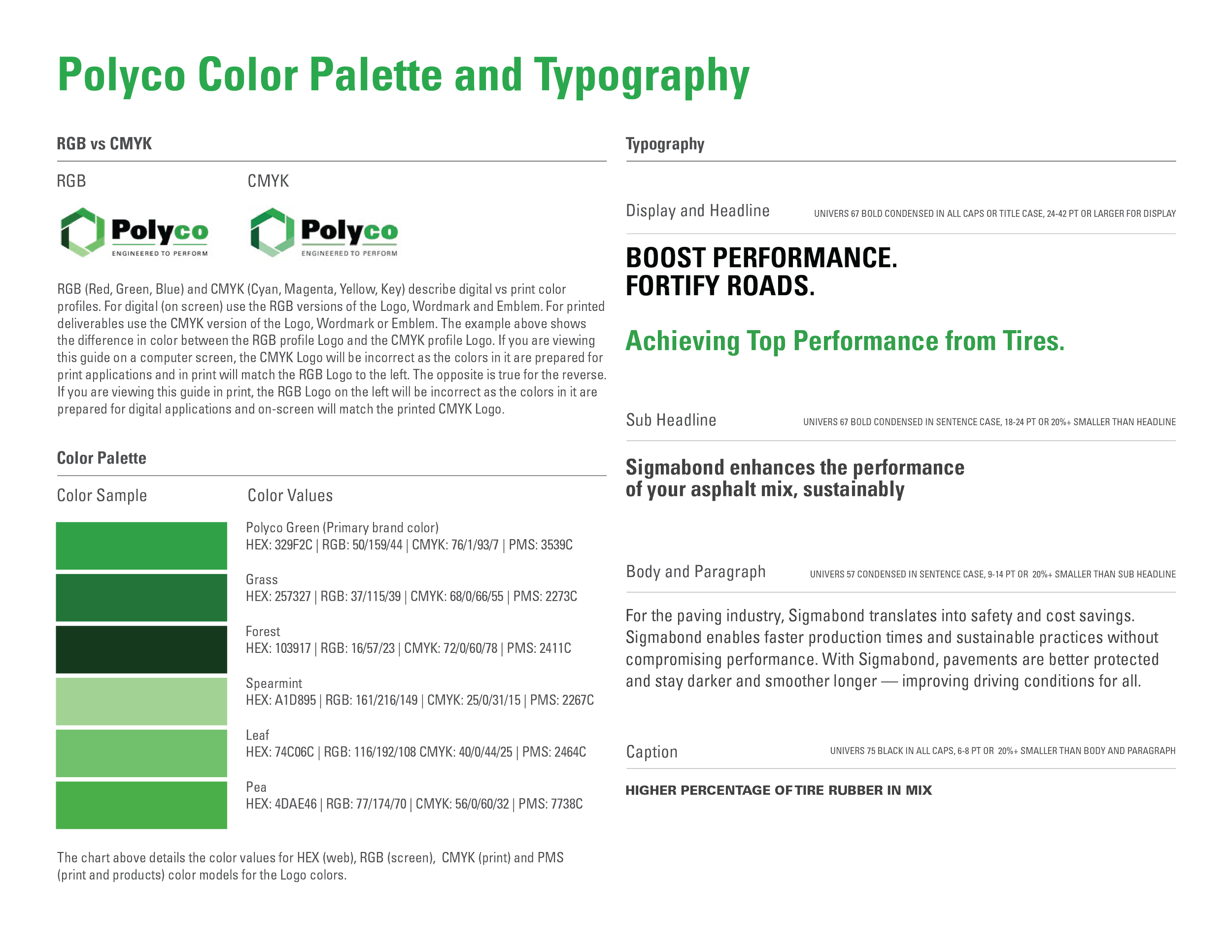
The Hexagon is also meant to be reminiscent of the universal recycling symbol. The color palette reflects the concept of “Green” being not only a visual cue towards the sustainable qualities of their products but an important concept and marketing term – “From Black to Green.”
The logotype created by Jake is split similarly, using black and the primary brand color to separate the two suffixes used to create the name “Polyco.”
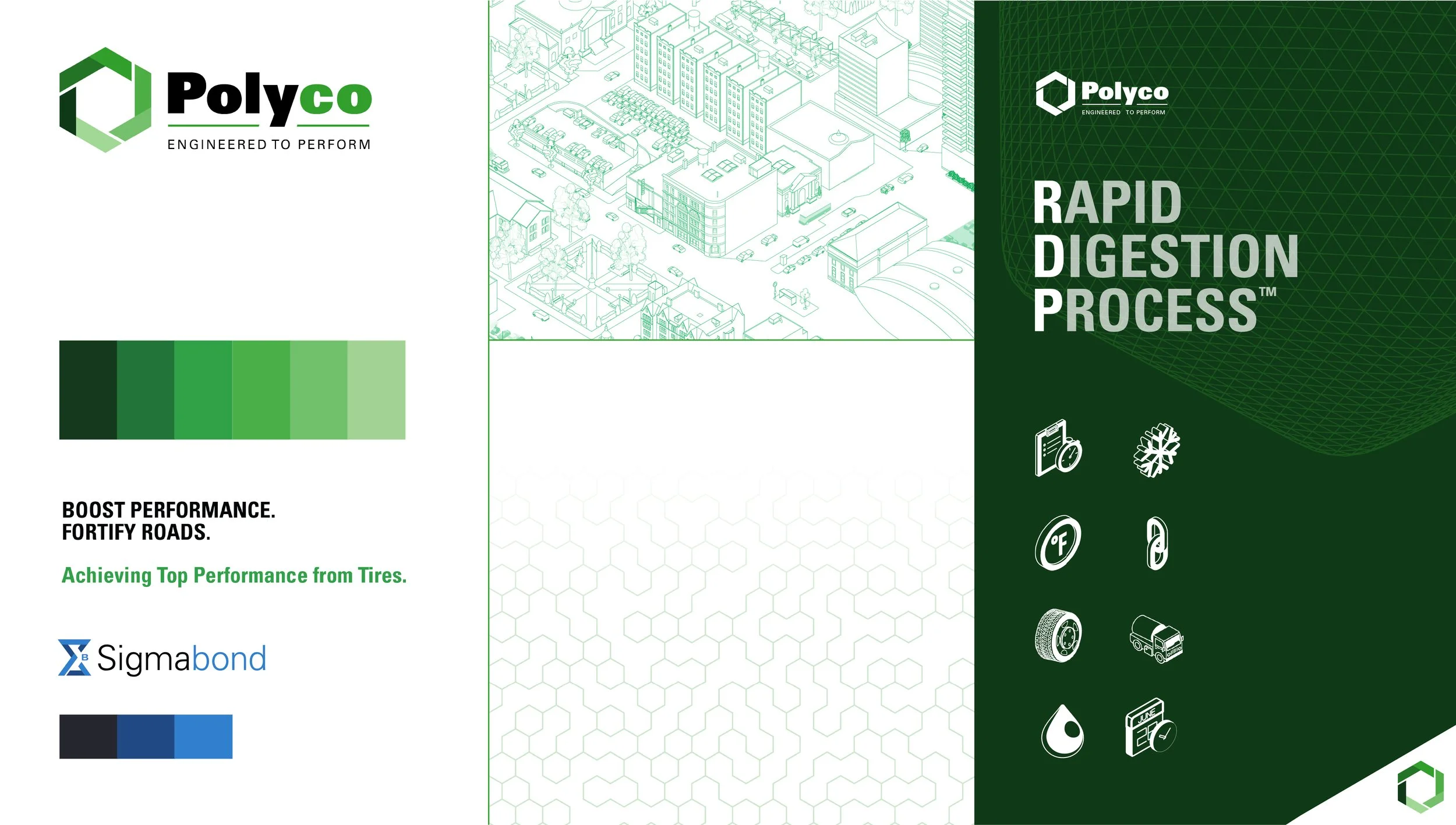
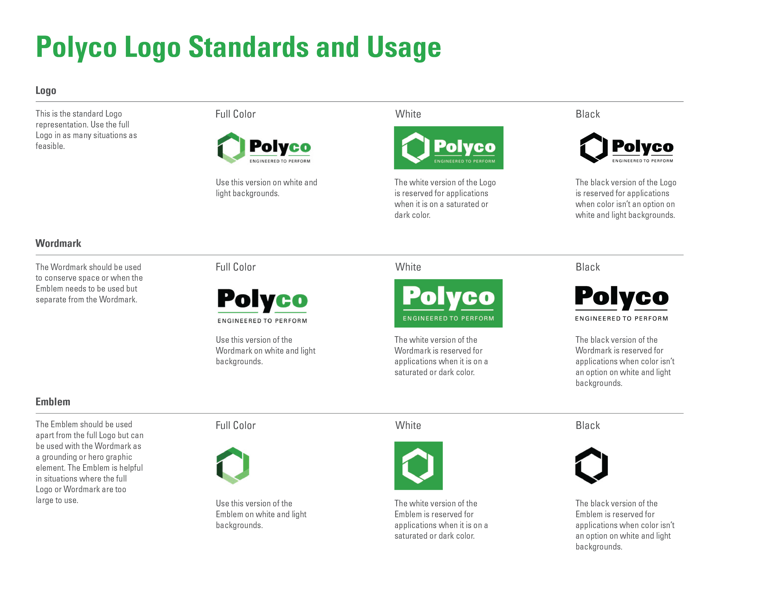
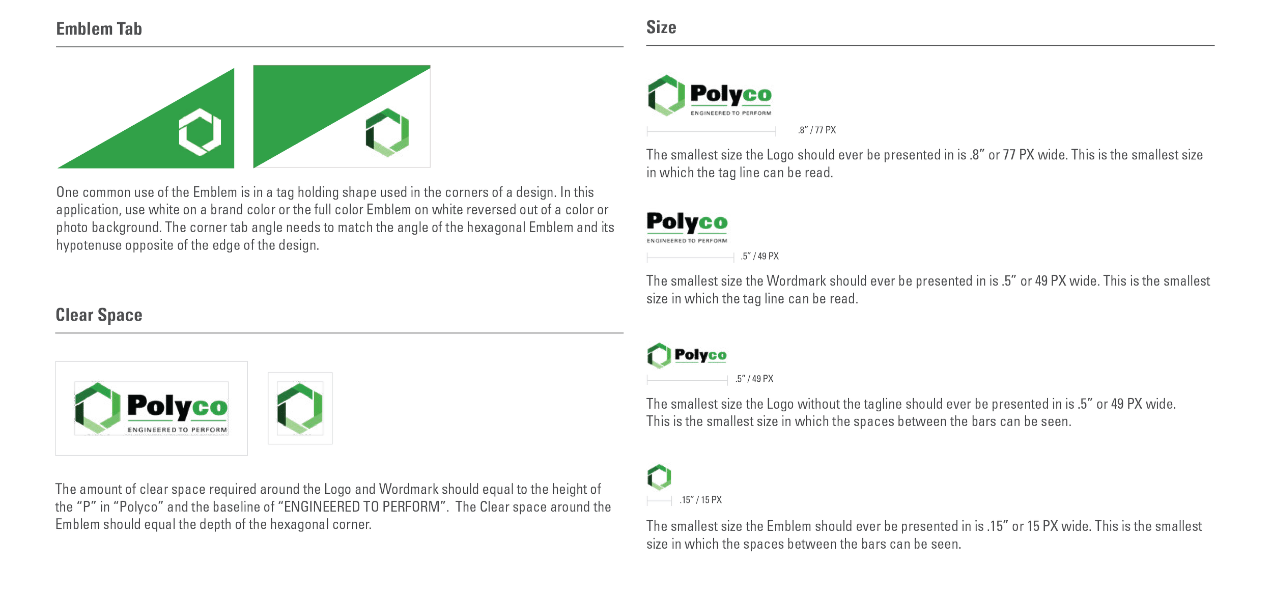
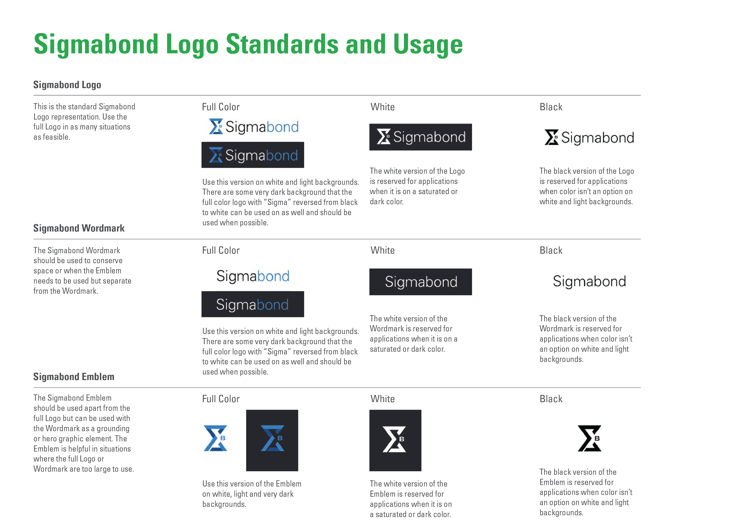
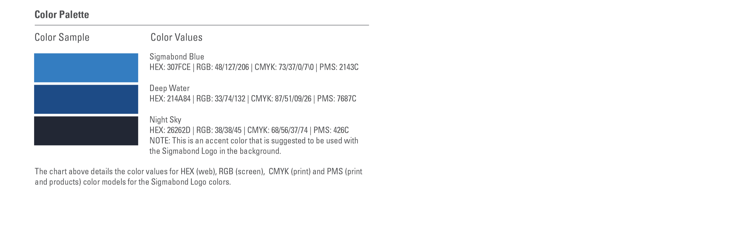
After creating a working “kit of parts” for the visual identity system, I set to the task of creating easily understandable guidelines for the Polyco team to effectively use their new branding. These guidelines focused primarily on use of the logo, color palette and basic product branding (Sigmabond being the example.) More complicated brand applications, such as across the website and marketing materials, were left to us at Sol.
Brand applications and projects survey
From 2021 through 2023 I and the design team at Sol Design Co. developed many projects for Polyco. The following selection are examples of deliverables that I directed and designed both independently and in collaboration with the design team and client.
Print Applications
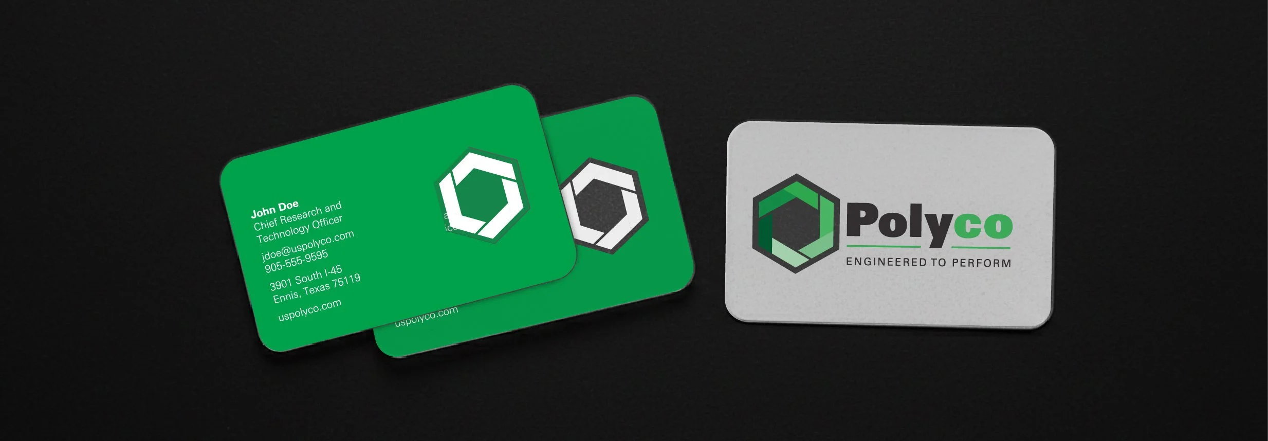
Leadership at Polyco requested business cards that would leave a lasting impression for tradeshows, conferences and important meetings. I design a variety of choices across many substrates and ultimately we went with post-consumer plastic cards with a transparent window containing the logomark on the front and back of the card. This aperture like window was the kind of novel but not over the top solution they were seeking.
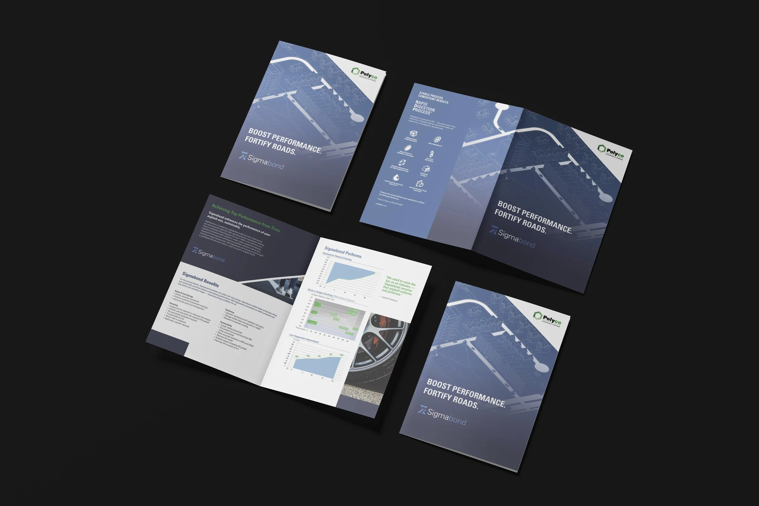
Sigmabond was Polyco’s primary and dominant product in the early 2020s, so much so that we developed a color palette and logo mark for all Sigmabond related materials. This bifold brochure is an example of how the brand flexed for product campaigns and sales materials.
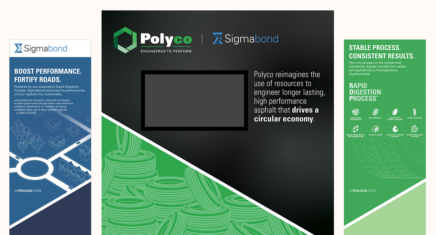
Tradeshow banners and media wall.
Digital and Screen applications
Tasked with creating an explainer video for Polyco’s premier product Sigmabond, we crafted a narrative basing the product’s “green” production and superior qualities in the power of the wheel. Although this was a group effort, I saw the entire project through from concepting, story boarding, art direction, illustration and editing. *Note: The Sigmabond colors have since been changed to Polyco green as opposed to the original blue.
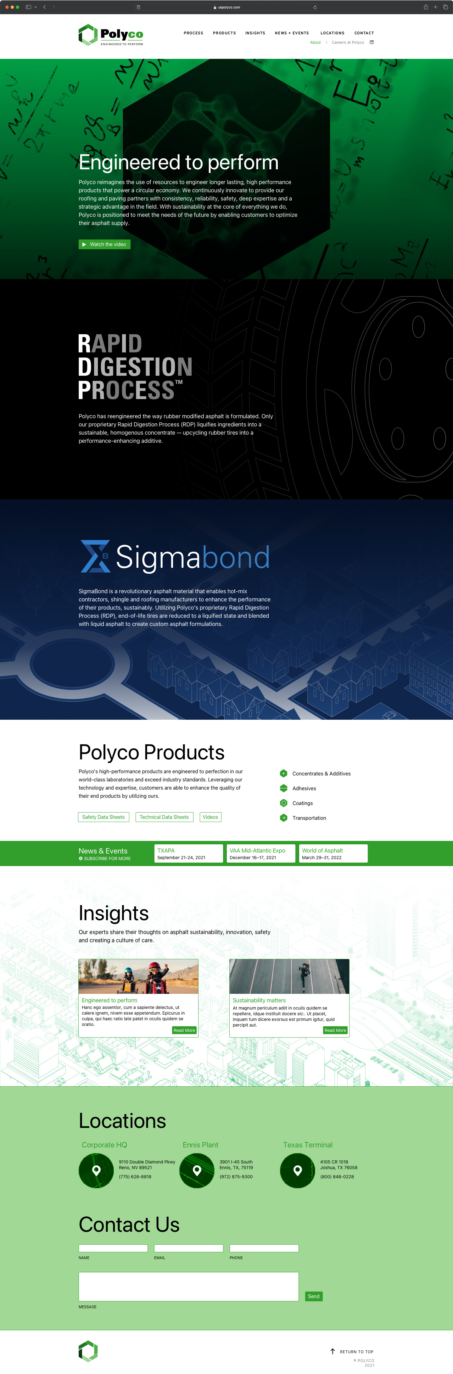
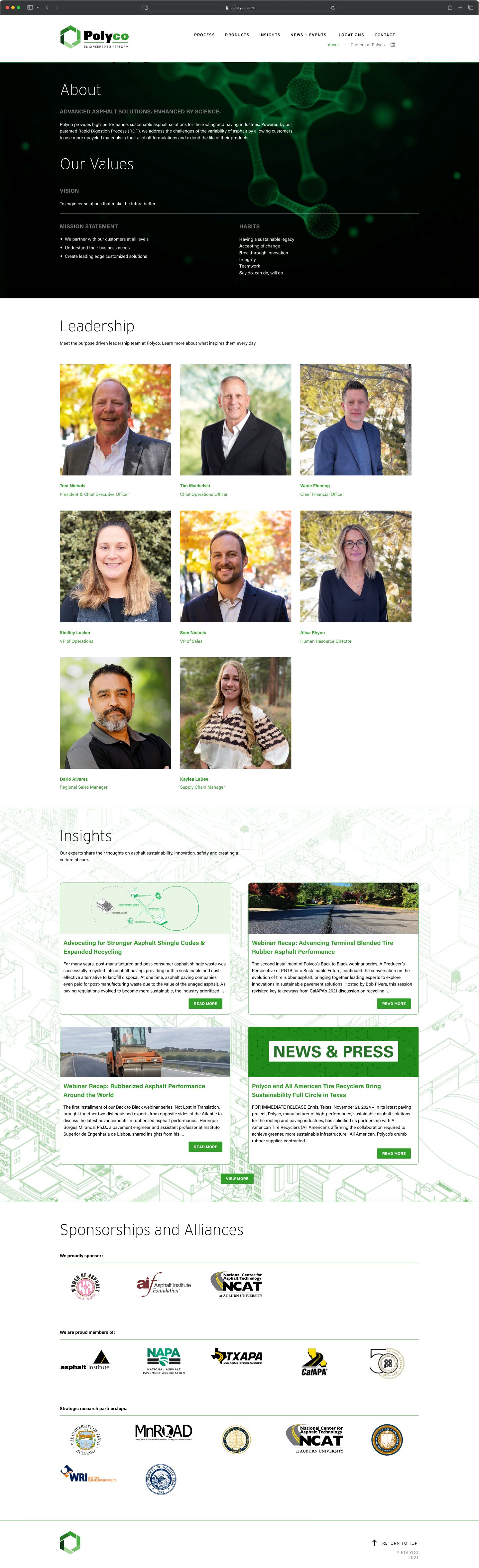
Homepage and About page, samples of full website.