Dynamix: brand refresh and guidelines
As a critical part of their growth strategy, Dynamix chose to update their visual identity system and subsequently their digital communications. Although the client was comfortable with updating the logotype, they requested we keep the “D” emblem. In addition to keeping the “D” in a lock up with the logotype, I also explored its use as a supergraphic and secondary identification mark. As an homage to their original logo, I incorporated blues and greens into their color palette. I also introduced a clean but casual illustration and icon style and art direction for photography (including a photo shoot of the leadership team). These new brand elements were outlined in a brand guidelines document with instructions for use, examples of applications in communications materials and links to the file architecture.

Dynamix logo before and after.
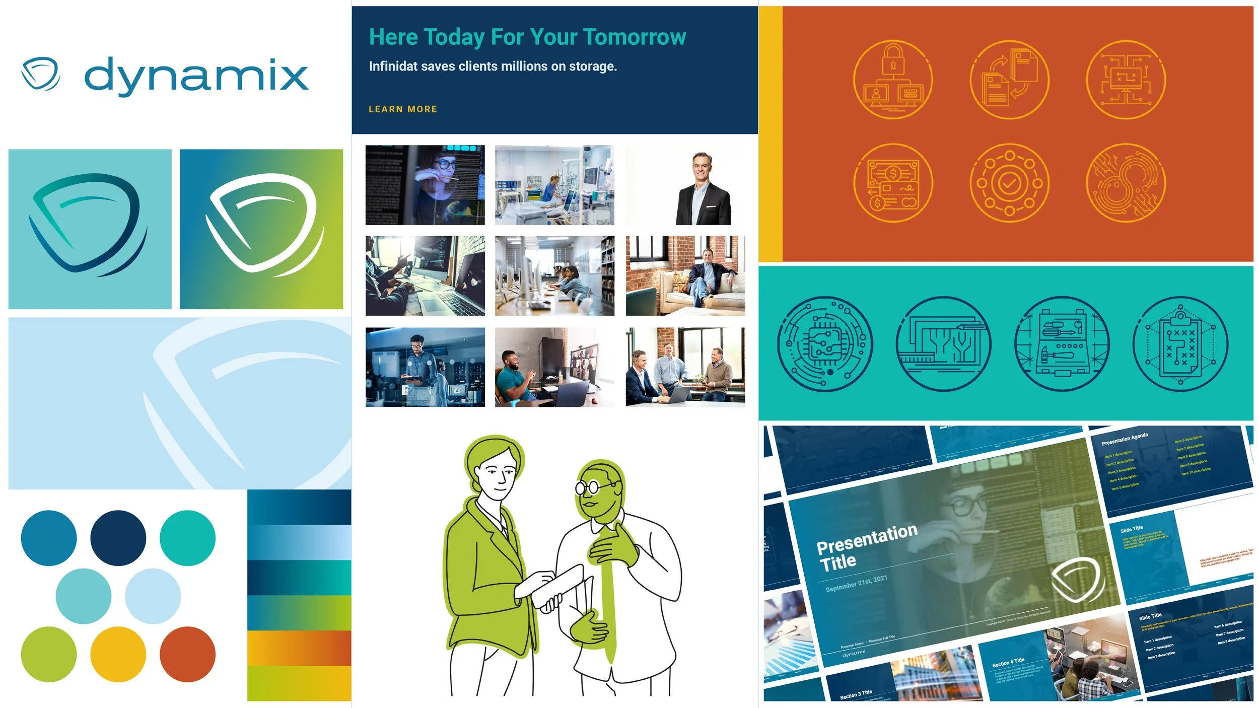
An assortment of Dynamix brand elements
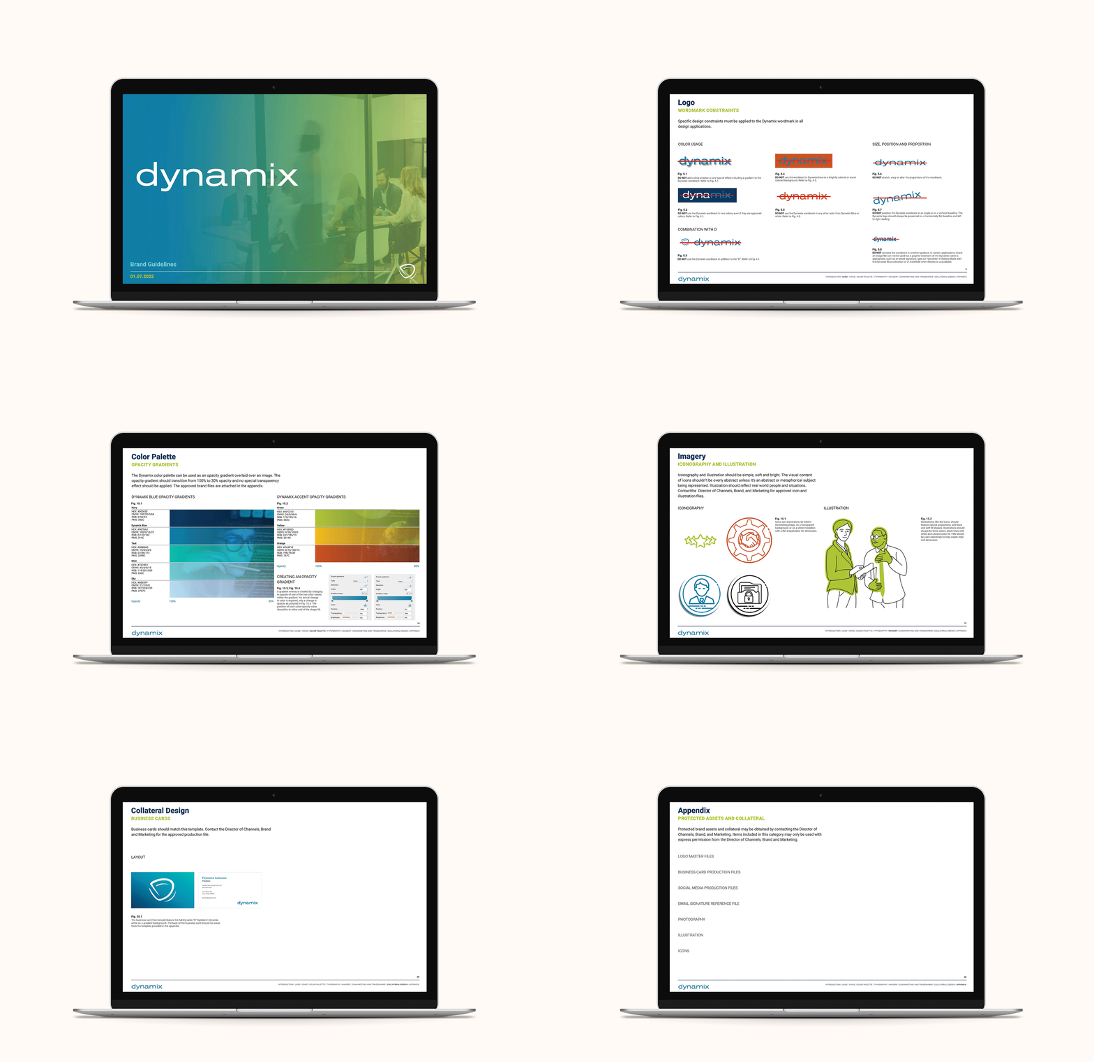
Dynamix brand guidelines.
Website Design
My primary goal for the Dynamix website was to humanize IT systems and security. Instead of images of data servers, indicator lights and abstract illustrations, the new brand called for evidence of success, the very human progress enabled by the data systems conceived of Dynamix. To support this idea we incorporated video and animations throughout the site, bringing life to clean and open layouts. The initial iteration of this site included looping animated characters (illustrated and animated by myself) set in realistic off settings for a sense of levity and novelty. During the three years that I was an Art Director on this account, I led not only the full redesign of the site, but also an updated design with a greater focus on photography.
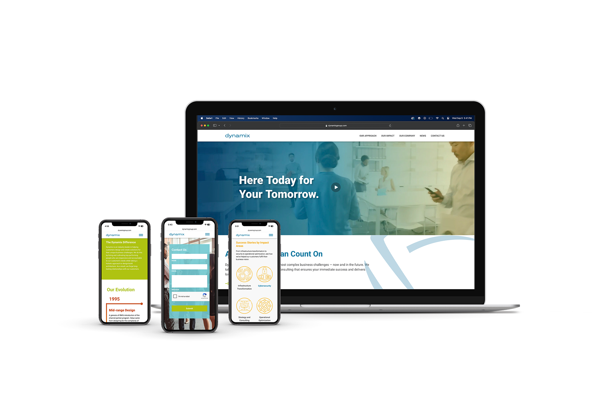
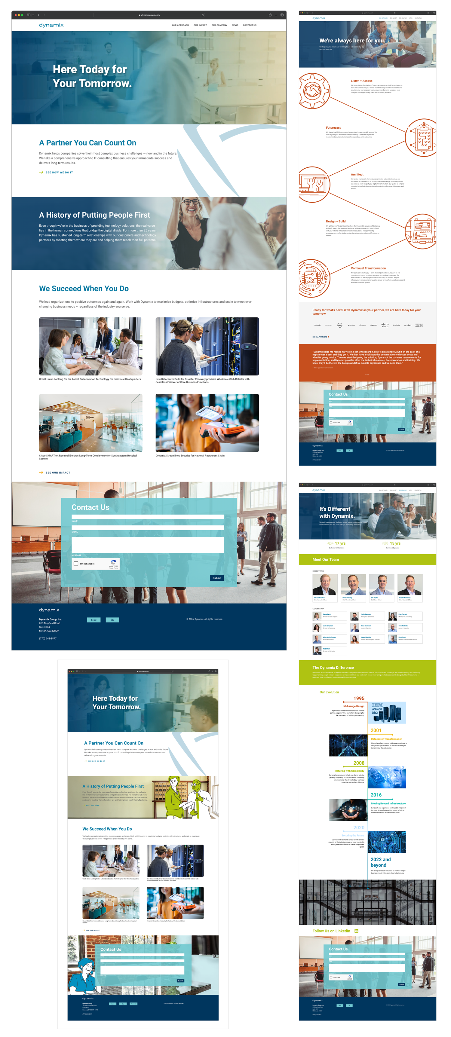
The redesigned Dynamix website. The inset image at the bottom left of this arrangement represents the first iteration of the design.